CTA Tips For Small Business Owners

Author: Helena
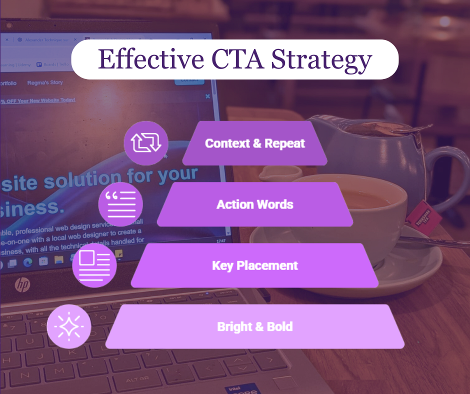
Your call to action (CTA) is one of the most important elements on your website, turning casual visitors into paying customers. For small business owners, a well-designed CTA can significantly improve engagement, generate more leads and boost sales for your online store or service pages. Don’t let it get lost, make sure your CTA stands out visually. Use bold colours, easy to read fonts and buttons that catch the eye to guide visitors toward taking action.
Placement is just as important as design. Your CTA should appear where your audience naturally looks, whether at the top of the page, after key information, or strategically throughout your website. Avoid burying CTAs at the bottom of your page, as poor placement can reduce click through rates and lower your website’s overall effectiveness. Thoughtful layout and positioning help ensure your visitors see and interact with your offers.
The wording of your CTA also plays a crucial role in conversions. Use clear, action driven phrases like “Get Started,” “Claim Your Offer,” or “Shop Now” so visitors immediately understand what to do. Combining actionable text with a clear benefit builds trust and encourages users to take the next step.
Finally, give context and repeat your CTA strategically on longer pages. Explain the advantage of clicking near the button, and don’t hesitate to include it multiple times so readers can act whenever they’re ready. A combination of strong design, smart placement and clear messaging ensures your small business website or online shop maximizes clicks, increases conversions and drives measurable growth.