Colours
Mango
Mango
Dry Sage
Dry Sage
Almond Silk
Almond Silk
White
White
Typography
Lilita One
Bookmania
Brand direction summary
Ease & Poise is a calm wellness brand identity designed as part of a wider web design and branding project for a small business client.
The direction focuses on softness and ease, creating a visual identity that feels human, approachable and free from anything corporate or clinical.
The brand identity was developed with a focus on modern web design principles and soft minimal branding, using gentle colour choices, balanced typography and spacious layouts to create breathing room throughout the design.
These elements work together to support an intentional user experience across both branding and website design.
The work includes both the brand identity and the website, designed to feel calm and accessible.
Additional branding assets
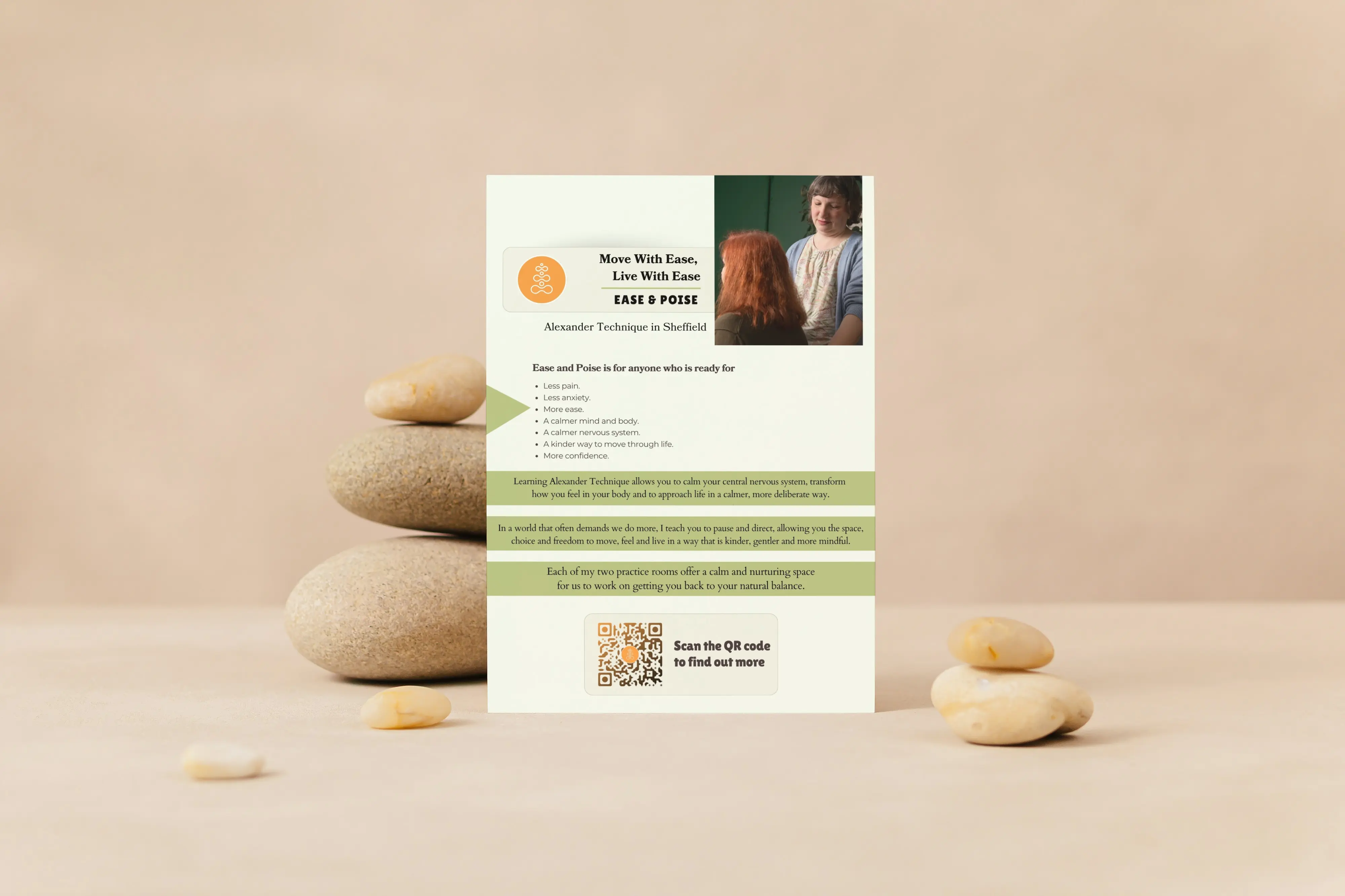
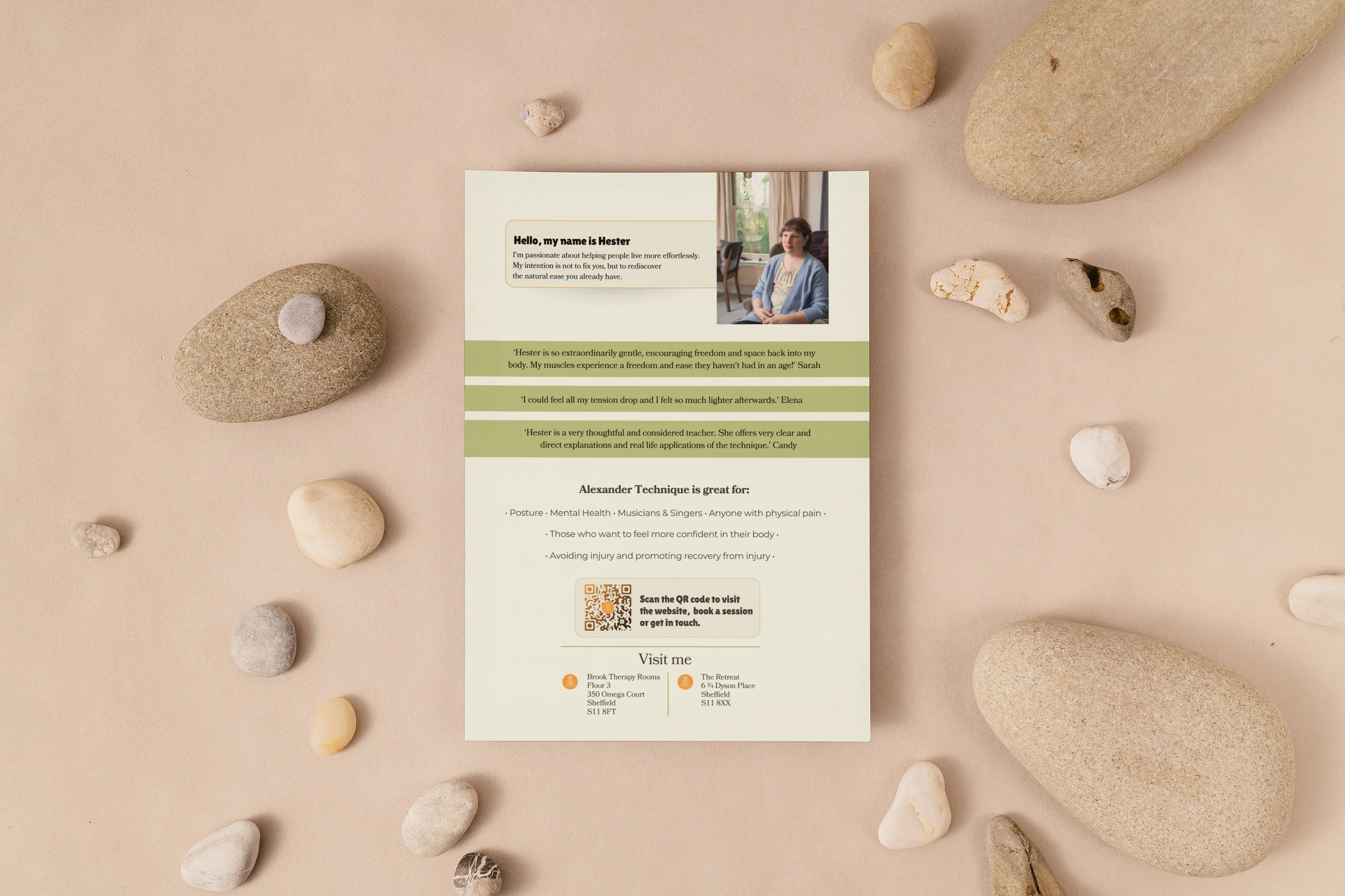
Promotional flyer design
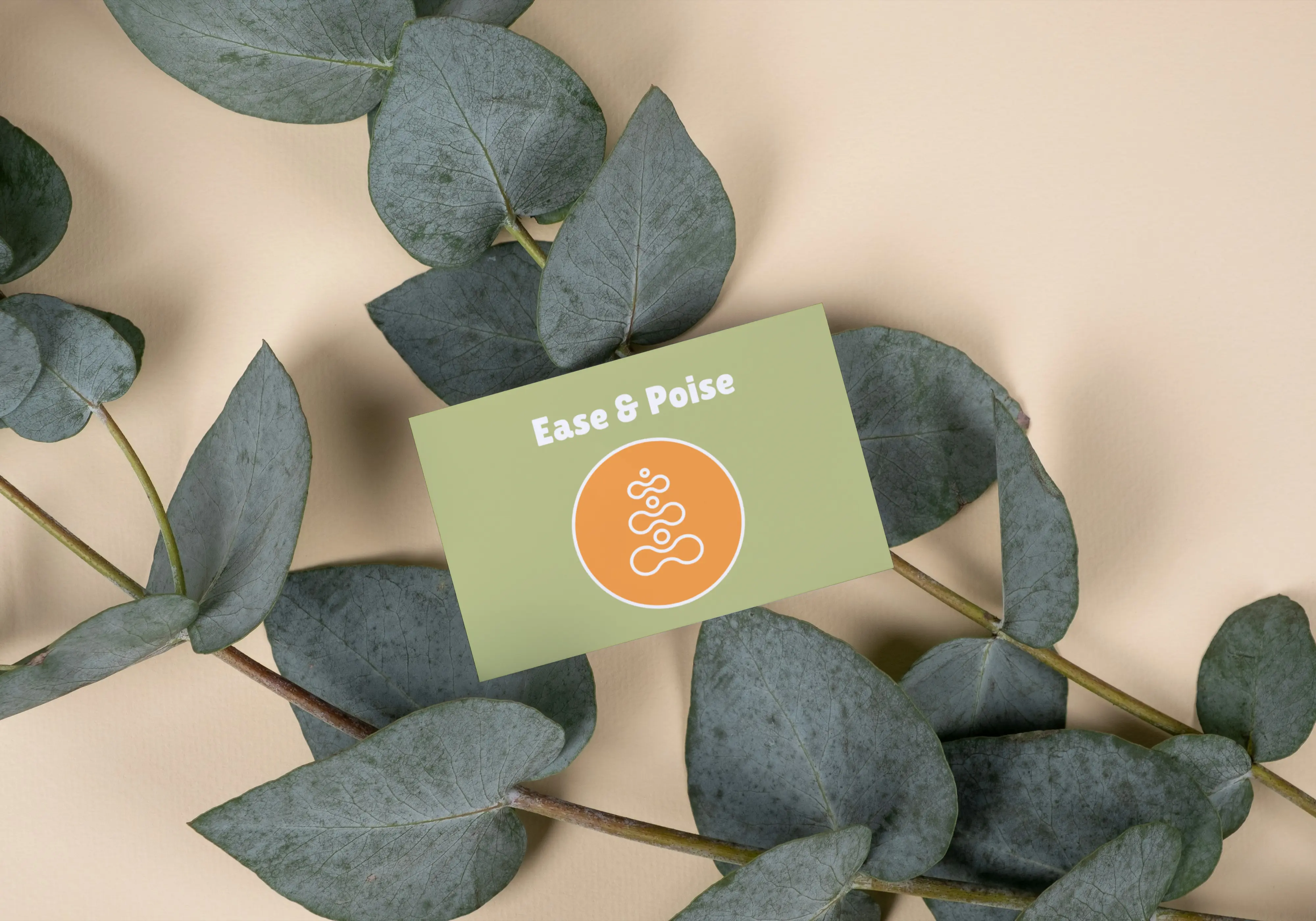
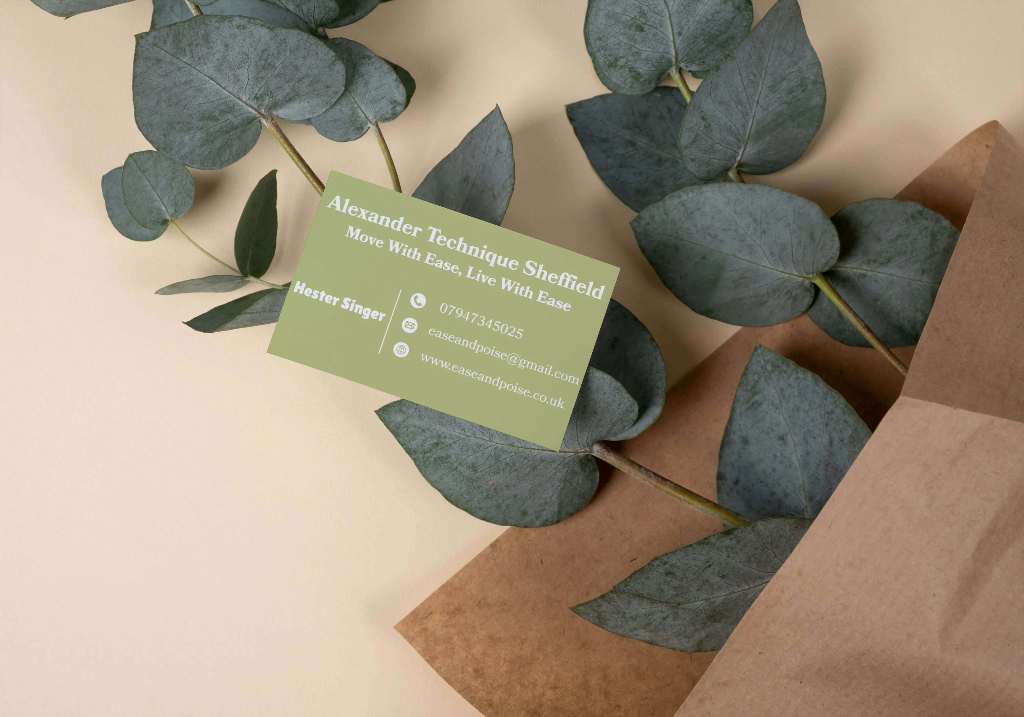
Business card design