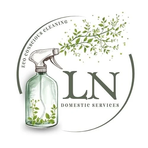
LN
Domestic Services
Eco - conscious cleaning
Colours
Key Lime
Water
Key Lime
Water
Pick Your
Poison
Pick Your
Poison
White
White
Italian Basil
Italian Basil
Typography
Zenaida
Neato Serif
Brand direction summary
The visual identity for LN Domestic Services was designed to create a distinctive and professional presence within a highly saturated market.
Moving away from generic, template based branding, the new direction focuses on creating a recognisable identity that reflects the business values while establishing a stronger sense of credibility and trust.
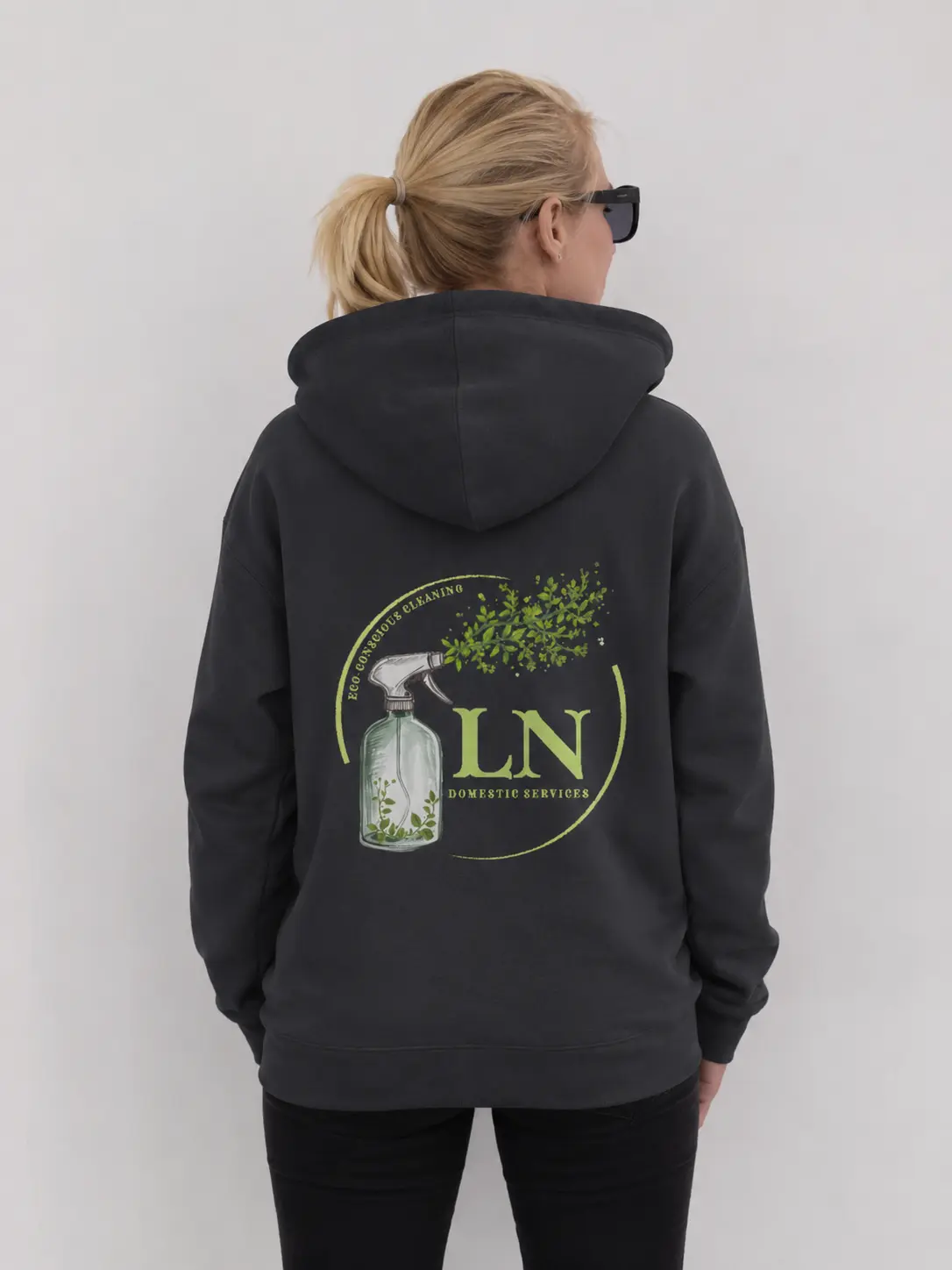
At the heart of the brand is a bespoke illustrated mark that combines familiar cleaning elements with natural botanical details.
This approach communicates the company's eco-conscious ethos without relying on the conventional imagery often associated with the cleaning industry, resulting in a brand that feels both authentic and memorable.
Supported by a fresh, nature inspired colour palette and elegant typography, the identity balances professionalism with warmth. The result is a cohesive brand system that differentiates LN Domestic Services from competitors and provides a strong foundation for future growth across social media, print materials and branded merchandise.
Brand Applications